FRED
BOLARINWA
Invisible Hands
Seeing racial bias through the sensor of a faucet
Project Type: UX Research and Design
Team: Solo Project
Introduction: An ongoing project exploring the intersection of race, technology, and product design. Sparked by firsthand experiences and research, this work investigates why automatic faucets often fail to detect darker skin tones, revealing a deeper, systemic bias in how technology is tested and deployed.
Through interviews, prototyping, and public installations, the project aims to make the invisible visible and encourage institutions to adopt more inclusive design practices.
Project Brief:
This project aimed to reveal and address racial bias in sensor technology through visual storytelling, user testing, and immersive design.
Project Outcome: Led to ongoing discussions around inclusive sensor design and inspired plans for an interactive installation across campus.
Initial Problem Discovery
Racial bias in tech is not a new concept
To better understand the problem space, I conducted a deep dive into technologies that have historically exhibited racial bias in their design, function, or outcomes.


Hey! Remember this for later
and the list could go on....
Through my literature review, I had a few main takeaways:
The problem isn’t the technology, it’s the lack of emotional intelligence, cultural awareness, and diverse lived experience behind its creation.
"The issue isn’t necessarily with the technology itself, but the makers' inability to predict social consequences from their designs."
These issues aren't fully unknown; they're just rarely talked about
What do we do when these biases have already trickled down into these products where do we go from here?
Initial Research /Problem Validation
After exploring multiple technologies that perpetuate racial bias, I was struck by how many products perpetuate bias, especially one's that effect everyday health and diagnosis
Being unable to use faucets has proven to be deadly. Washing your hands is the simplest way to reduce the likelihood of contracting a respiratory virus, and in the case of COVID-19, which has killed at least 1,219,487 in the U.S. alone, the virus is proven to be dangerous.
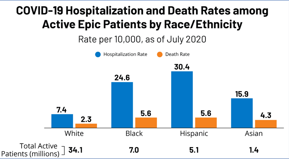
Having a device such as a faucet that works properly could have saved many lives. In the provided data, Black and Hispanic people were over 3x as likely to be hospitalized during the pandemic, and over 2x as likely to die compared to their white counterparts.
Even outside of the pandemic, Black people are disproportionately being killed by general respiratory viruses at a disproportionate rate. In a study done prior to the pandemic, 52 bacterial species were found on washroom fixtures.
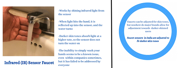
With respect to the fact that IR faucets and pulse oximeters don't work well for darker skin tones, it makes sense that respiratory diseases have been disproportionately affecting people of color.
With how harmful racial bias in technology can be to one's health, and how it affects everyday moments,The faucet became my lens: a simple object that quietly reveals how exclusion is built into our daily interactions.
User Research/Interviews
I conducted 8 interviews with students, doctors, and organizers to get a better understanding of the vast problem space..
These are the main takeaways


The interviews with the medical professional and movement organizer were conducted via zoom
Due to the nature of their positions they requsted to be unnamed

Through these interviews, I found that students recognized the issue. Many expressed feelings of helplessness, avoidance, or strategic adaptation, but coped by minimizing their engagement or pretending the problem didn’t exist. Others feared the consequences of inaction but felt unable to address the issue.
A common thread that tied all issues together was powerlessness that left students silently navigating a broken system.
Interviews from the Research and Design teams at companies that make faucets were attempted with no luck.
What was found is that these design teams in these companies lack positions that work to engage the user experience, something that leads to a lack of representation in design, especially as minorities are historically underrepresented in corporate America.
Instead, interviews with medical professionals and organizers were conducted in order to understand the intersectionality within the problem space

Synthesis
With a condensed timeline for synthesis, I honed in on the most salient emotional and social pain points to guide my design direction.
I created 2x2's, an Iceberg model, a persona, but the best insights came from the latter two

Why did we choose these initial research methods?
These frameworks help to categorize feelings into digestible insights, they uncover a deeper truth.
This is necessary due to the nature of racial bias in tech, often hidden beneath the surface
easy to overlook unless you know what to look for
From background research to user research to interviews, then synthesis frameworks, the culmination of my work is here!

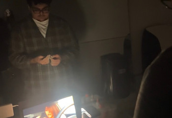
Meet Sid!


Now, let's ideate!
Ideation
From the synthesis phase, I created 3 How Might We’s draw the roadmap for ideation

A.I. is a tool not an enemy!

For ideation, I used the Role-Storming, mind mapping and Heuristic ideation methods, but ultimatlely the method that yielded my intial ideas was the 100 ideas method.
I asked CHAT GPT to give me 25 in-the-box ideas, 25 out-of-the-box ideas, 25 ideas with no bounds, 25 simple ideas, and 25 wild ideas. The goal with this was to have a multitude of ideas, which, even if they weren’t all feasible, the ideas would still have an aspect that could inform a design decision
(psssst not all 100 are shown)

After going through the ideas, I honed in on the three that intersected with information from the synthesis phase


Historical Archive

To understand what I should put in the space, I utilized the guided visualization technique where I had 2 users come into an all white room at Harvey Mudd to visualize a gallery
At the end of the activity, I asked these questions:
-
What did you see first when you entered the archive?
-
What specific object or interaction stayed with you most?
-
What colors, textures, or sounds were present?
-
What happened when you reached for the faucet?
-
What emotions did you feel during the walk?
-
Did the archive feel like it was for you? Why or why not?
-
If this space were real, what would you add to it?
-
What should people leave this exhibit knowing or feeling?
For both of the participants, their answers only talked about the examples I gave them, and their emotions weren’t really affected.
The archive was informational, but didn’t provide emotional change.
In an attempt to salvage the gallery, I decided to combine both the historical archive and the fashion show into one.
The idea would be that the crowd would watch as the model walks down the runway, trying technology that doesn’t work for her. The audience will then follow her into the bathroom, where she will explain the technological archive, and the exhibit will be opened.


These ideas were abandoned due to feedback from those I interviewed. The ideas were great in theory, but the call to action was missing, and it did not directly capture the emotional pull needed to evoke change. This was especially apparent through my visualization activity.
Ideation!
The last idea left standing was the “faucet experience.”
I decided to take the chance on it after remembering the quote from Doctor D!

“ The first step in starting anything is getting people to recognize the problem”
In order to create the experience, I had to see for myself how serious the problem was, or if it’s even a problem around the facilities that surround me.

My idea was originally to have 5 different people of different skin tones test IR sensor faucets around the 5 colleges. The issue with this was scheduling, being able to replicate the test setup (hand positioning each time), and the fact that skin tone ranking systems like the Fitzpatrick Scale aren’t representative of the global skin tones of POC.
Testing/Usability testing


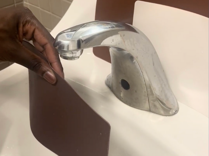
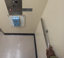
While researching, I stumbled upon silicone skin sheets that tattoo artists use to practice on different skin tones. They aren’t created on a scale, rather in comparison to different skin tones different tattoo artists have worked with. I purchased 5 different sheets, going from a pale white, to a peach color, to light brown, to dark brown

To test my experience, I ran usability testing with 10 trials of the dark brown shade, light brown, tan, and white shade under IR sensor faucets at Harvey Mudd, Pomona, and Pitzer College (as a bonus, on my flight to Japan for a diplomatic venture). Each trial consisted of holding the sheet in the IR detection zone for whatever time it took to turn on. If the time to turn on exceeded 1 minute, the time column was marked with an X in Google Sheets, denoting a failure.
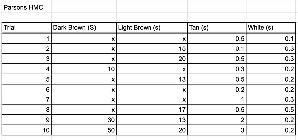
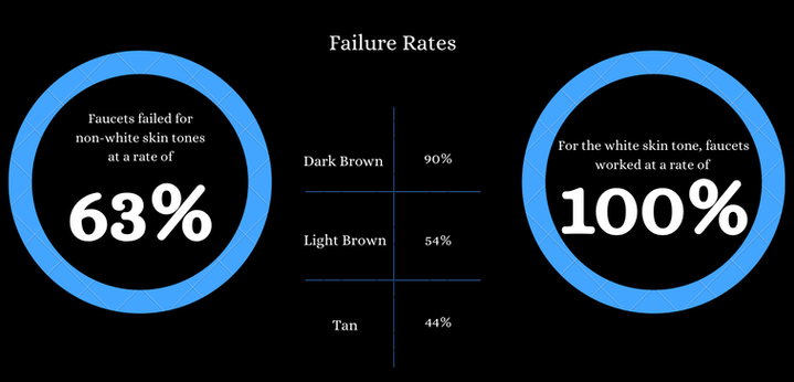
Results!!!!

Testing/Iterating
Based on feedback from those who saw the video, this was the single most eye-opening and powerful narrative they've seen on the topic.
While it was powerful storytelling, viewers of the video explained a need for more, an interactive experience that connects the feelings of that video to a tangible experience, personalizing the problem.

At first, I had no idea how to do this. I was in a corner I didn't know how to get out of, that was, until I went to toch some grass.
I went outside just watching one of my feedback particpant, playing with their sibling after our session.
In that moment, something struck.
To create the experience, sometimes you need to reduce the interactions to simple flows.
A kid playing outside, an everyday experience, relates directly to getting your hands dirty. By doing this, the topic of needing to wash your hands comes up. Something simple that people of a darker complexion struggle to do.
Through storyboarding, I generated an interactive prototype, where participants would follow simulations of daily events that "contaminate the hands". Recording feelings, thoughts, and expressions, subsequently showing them the testing video, to cause an urge for action


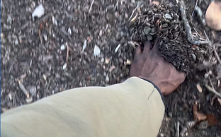
Playing in the dirt

Sneezing

Touching a railing
Each test of the interactive experience was recorded via video
Insights and feedback are synthesized below!

In order to allow for more reach, I edited the recordings, making a video showcasing the experience, testimonials, and the testing video, installing in bathrooms across the college.

Call to action
But still, I was missing something
I needed something that led people to action
So I created a new HMW
How might I take advantage of other forms of user interaction to cohesively broadcast the issue, and create change

I created a flyer, a movement that sparks action.
only, it didn't.
I placed it in the bathrooms but got little interaction
Feedback:
-
Colors are decent, but could be more blaring and eye catching.
-
We're at a college, use something that catches a student's eye, something that speaks our language
-
What do I do about this problem? It doesn't lead me to anything
-
Only works when paired with the video installation, would be stronger if was something that can stand alone as well
-
Confusing message
Iterating
I then iterated on that flyer, taking feedback into account
Outlined the flyer in Red (visual salience)
Created a large F in red (speaking the language of the students)
Utilized large red words for FAIL and 63% (drawing readers in to the most alarming statistic)
QR code that leads to testing video for proof, and information to contact the president's and facilities and maintenance offices for the 5 colleges, along with a sample message.
Iteration 2

The flyers were placed throughout the campuses in bathrooms, classrooms, on walls, on doors, etc.
I registered 200 scans of the code, which allowed me to meet with and present my findings to the schools
We're now working on ways to reconfigure or reinstall faucets across the campuses!
Something new that I learned…
Sometimes, the simple interaction, whether it's physical or digital, is the best fix. No need to overcomplicate something that doesn't need to be. Especially when trying to evoke emotion and create a feeling that turns into action, it comes down to clarity, not perceived complexity
My biggest challenge was…
working to define a problem in such a large scope. Racial bias affects a lot of different technologies, from Apple iWatches to pulse oximeters to IR faucets, similar to accessibility, with interfaces like Apple's liquid glass. It plays into many aspects of design and technology, so figuring out what path to take required a lot of detailed research. The greatest thing about broad scopes is that you get to be really creative with your solutions
My favorite part was…
being able to solve a problem that was close to my heart and the community around me. Being a UX designer to me is all about empathy, and not only was I able to be empathetic, but created experiences that allowed people to exhibit empathy as well. In that way, we all became UX designers together!